
Great journey’s start with a single step. Here is a simple linear regression plot using python. Let’s see where this takes us.
import numpy as np
Michael J. Pierce
from numpy.polynomial.polynomial import polyfit
from scipy import stats
import pandas as pd
import matplotlib.pyplot as plt
df = pd.read_csv(“tntot-stats.csv”)
x = np.array(df[‘Pre-Roll’].values)
y = np.array(df[‘Mid-Roll’].values)
slope, intercept, r_value, p_value, std_err = stats.linregress(x,y)
print (slope, intercept, r_value, p_value)
# Fit with polyfit
b, m = polyfit(x, y, 1)
# print (“poly: “+str(m))
plt.plot(x, y, ‘.’)
plt.plot(x, b + m * x, ‘-‘)
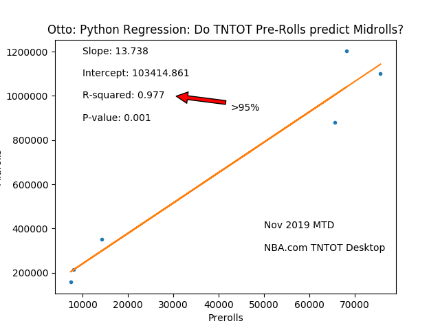
plt.title(“Otto: Python Regression: Do TNTOT Pre-Rolls predict Midrolls?”)
plt.xlabel(‘Prerolls’)
plt.ylabel(‘Midrolls’)
plt.text(10000, 1200000,’Slope: ‘+str(round(slope,3)), ha=’left’, va=’center’)
plt.text(10000, 1100000,’Intercept: ‘+str(round(intercept,3)), ha=’left’, va=’center’)
plt.text(10000, 1000000,’R-squared: ‘+str(round(r_value,3)), ha=’left’, va=’center’)
plt.text(10000, 900000,’P-value: ‘+str(round(p_value,3)), ha=’left’, va=’center’)
plt.text(50000,400000, ‘Nov 2019 MTD’)
plt.text(50000,300000, ‘NBA.com TNTOT Desktop’)
plt.annotate(‘>95%’, xy=(30000, 1000000), xycoords=’data’,
xytext=(0.6, 0.75), textcoords=’axes fraction’,
arrowprops=dict(facecolor=’red’, shrink=0.05),
horizontalalignment=’right’, verticalalignment=’top’,
)
# plt.show() Need tkinter to have interactive
plt.savefig(“mpgraph.png”)
# plt.hist(x)
# plt.ylabel(‘No of times’)
# plt.savefig(“mpgraph2.png”)